What’s a placeholder?
A placeholder is a bit of text that you can add to an input field. Your visitors and would-be subscribers will be able to see this text. It will disappear once you start typing in the field, and the text will not be used once someone submits your form by accident. It’s a great way of telling people what input you expect them to enter in the field!
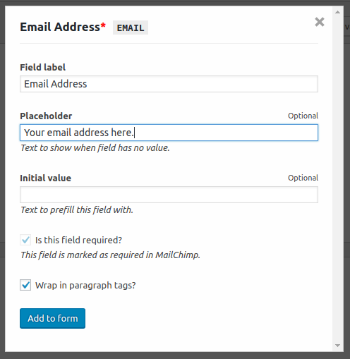
When generating your form fields using our field helper you can set your own placeholder text.
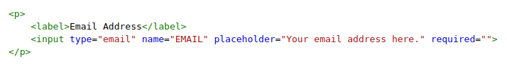
This will generate the following field HTML. Notice the placeholder attribute in there?
When you place this form inside a widget, page or post, the placeholder will be visible for all the see. Usually it has a grey color and it will disappear once you start typing something in the input field.

Styling the placeholder text
Styling the placeholder itself is a bit harder because of the way the various browsers handle this, separately.
It can be done by adding a few lines of CSS to your theme stylesheet. You can find this file by going to WP Admin > Appearance > Editor or over FTP by editing /wp-content/themes/your-theme/style.css.
An easier option is to use our Simple Custom CSS plugin.
Below you’ll find a list of lines to add to the stylesheet.
.mc4wp-form ::-webkit-input-placeholder { /* WebKit browsers */
	color: #888;
}

.mc4wp-form :-moz-placeholder { /* Mozilla Firefox 4 to 18 */
	color: #888;
	opacity: 1;
}

.mc4wp-form ::-moz-placeholder { /* Mozilla Firefox 19+ */
	color: #888;
	opacity: 1;
}

.mc4wp-form :-ms-input-placeholder { /* Internet Explorer 10+ */
	color: #888;
}
That’s it! You should now have a black placeholder text with a font size of 12 pixels.